DESCRIBE IMAGE

Direction: Look at the chart below. In 25 seconds, please speak into the microphone and describe in detail what the chart is showing. You will have 40 seconds to give your response.

Q1. Describe Image

Record Your Answer:

Sample Answer:

The chart shows the number of total passenger miles by mode of transport in Britain between 1995 and 2015. Over this period the passenger miles in a car rose steadily from 300 billion in 1995 to 360 billion in 2015. Like transport wasn't so consistent the passenger miles travelled using this mod fell to a low of 30 billion in 2005 but then this rose to about 60 billion in 2015.

Q2. Describe Image

Record Your Answer:

Sample Answer:

This graph shows that globally messaging apps were significantly more popular than social networks by 2017, with roughly 3750 monthly users as opposed to around 3250 monthly users on social networks. In fact, the number of monthly users for messaging apps started to exceed the number of social network users in 2014. From then on the number of users for social networks increased steadily, where is the number of users for messaging apps rose more rapidly.

Q3. Describe Image

Record Your Answer:

Sample Answer:

This chart shows that between 1996 and 2018, global spending on luxury items grew significantly from about 80 billion to about 260 billion euros. At first, there was a steady increase up until the year 2000 when spending remained the same for a few years. Then in 2004 spending began to climb rapidly again before a noticeable full in 2009. From 2010 onwards global spending seems to recover. After 2016, the spending remained at almost the same level.

Q4. Describe Image

Record Your Answer:

Sample Answer:

The bar chart shows the market shares in percentages for 7 supermarket companies in 2018 and 2019. The company with the largest market share in 2018 was Fernsby's supermarkets with 23 percent. In the second and third places for the same year, were Woodbead & sons and Polyfino hypermarkets. These 3 supermarkets were in the top 3 in 2018, but Jarsdell Megastores moved to third place with 17 percent of the market share in 2019. The remaining supermarkets all increased their market shares.

Q5. Describe Image

Record Your Answer:

Sample Answer:

The graph shows the top 3 sources of electricity in the UK, during the years 2009 to 2019. The most used source is natural gas which began as the most used with 45 percent and finished in 2019 with just under 40 percent. All 3 sources showed a decline in use but the use of coal fell dramatically, starting at just under 30 percent by 2019 the figures drop to under 5 percent. Figures for nuclear power decreased from 20 to around 18 percent.

Q6. Describe Image

Record Your Answer:

Sample Answer:

The bar charts show percentages for youth activities at weekends in urban and rural areas. The most popular activity in both places is using social media, accounting for just over half of the time. In contrast, sports and physical activities were the least popular weekend activities in cities and the countryside at 3 percent and 10 percent respectively. Interestingly, young people in towns visited their friends far more than in rural areas.

Q7. Describe Image

Record Your Answer:

Sample Answer:

The bar chart shows the number of small and large farms in 3 countries. Small farms of 50,000 square meters or less and large farms are 500,000 square meters or more. Country C has the largest number of small farms and the lowest number of large farms. Country B has the same number of small farms as large farms, while country A has the fewest farms with only 300 in total.

Q8. Describe Image

Record Your Answer:

Sample Answer:

This graph shows that the number of hospital beds per 1000 people worldwide gradually decreased, while the number of doctors per 1000 people worldwide slowly increased between 1990 and 2010. The number of hospital beds started at about 3.3 per thousand and then went up to 3.4 before falling to a little more than 2.5 in 2010. On the other hand, the number of doctors started at the lower level of about 1.2 and then went up to about 1.3 in the year 2000 increasing a little more in 2010.

Q9. Describe Image

Record Your Answer:

Sample Answer:

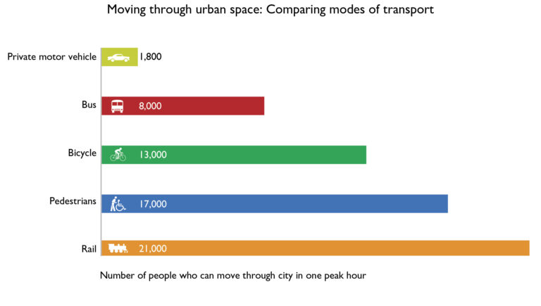
The bar chart shows how many people can travel in cities in one peak hour using different types of transports. The most efficient is the railway, trains carry 21,000 people. By contrast, private vehicles are the most inefficient, moving any 1,800 people in the same time. We can see that 13,000 cyclists and 17,000 pedestrians move through the same urban space as 8,000 people traveling in buses.

Q10. Describe Image

Record Your Answer:

Sample Answer:

The graph shows the proportion of Australians working and/or studying for the year 2019. There was a higher percentage of males working or studying compared to females for all age groups except for teenagers. After the age of 20, males surpassed females in terms of the percentage of those engaged in work or study. Between the ages of 30 and 39, their range of employment increased at around 90 percent. The percentage of females working continued to steadily decline, falling to just over 40 percent, in the oldest age group for the over the fifties.

Leave a Comment

Your email address will not be published. Required fields are marked *